A Microgrid Dashboard and Interface
This project, done in collaboration with OneTribe Creative and their brilliant and talented design team, was to create a Microgrid dashboard for operation metrics and mode setting.
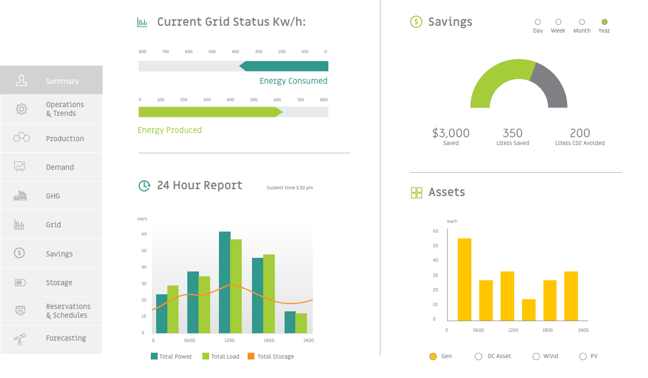
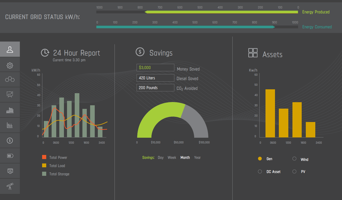
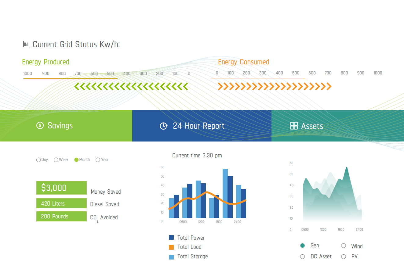
The bulk of the dashboard comprises widgets that show power generation, savings and environmental offsets. Then main screen also showed live movement of energy in the microgrid layout. In this still shot, energy was flowing from the solar and battery assets to the load as well as out into the grid.
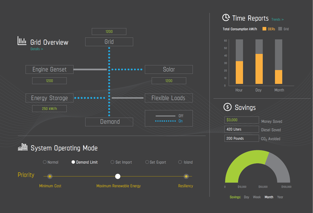
We also added another set of widgets to display information on the last twenty-four hours, and production per asset. Notice also the navigation bar on the left. The colors, set off from the dark background, were designed to highlight important data points more clearly. The sizes the sections were made to work well with a responsive design, as this UI had to work safely and effectively on mobile devices as well.
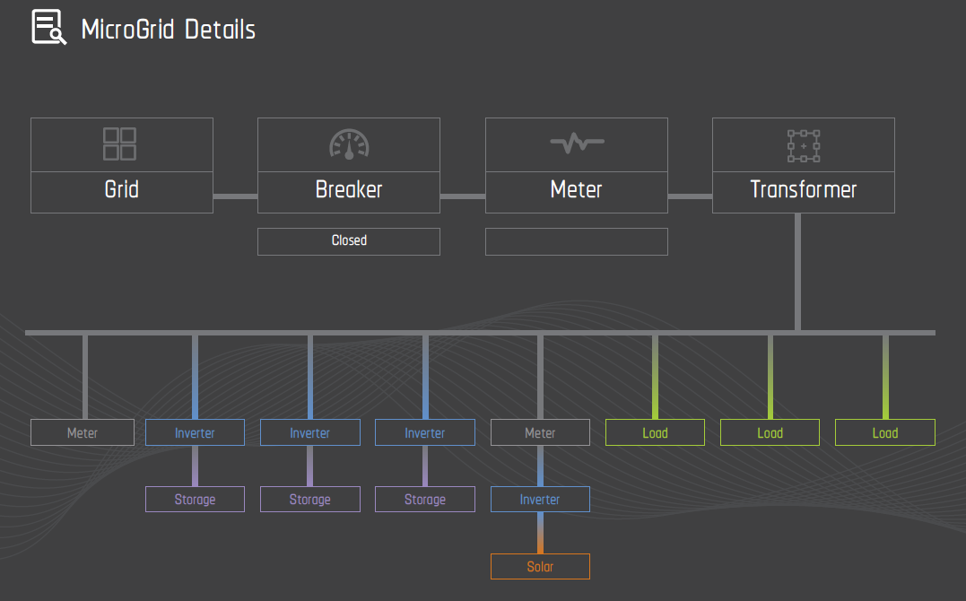
We wanted to represent the microgrid layout, without entering too much detail. This dashboard was not the controller - it simply provided summary information to the user. This layout worked well with a responsive design, and allowed the user to still see the activity from smaller mobile devices.
Themes are important not only for taste, but for accessibility as well. So we created a high-contrast white background theme also. Different widgets were included on each screen to represent the available options. As I have said elsewhere, seeing is believing! You have to see the options to get a sense of what looks right, what stands out, and what really works with the rest of the dashboard, and the rest of the data visualization.
We also created a different navigation bar for the white theme.